

There was a time when the most immersive video games on the market were nothing but words. These days, text adventures have gone by the wayside, but the importance that words play inhor games has not. They deliver crucial gameplay instructions, good and bad news, and occasionally breathtaking stories. And great fonts for games are how you make sure the shape lives up to the message.
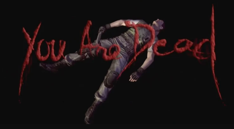
When you consider all of the moving parts that make a video game possible—from environment art to character models to animation to game design—it can be easy to overlook the important role gaming fonts play. But in many ways they can make or break the immersive experience. Sometimes, they can become iconic, as in the blood red serifs of Dark Souls’ “You Died.” In many occasions, gaming fonts are best when they are not noticed at all.
Between the purpose of the text, the video game genre, and general branding, there is a lot that goes into font choice. There are also so many to choose from that it can be an overwhelming decision. With that in mind, we’re going to walk you through the most important considerations when choosing the best gaming fonts.
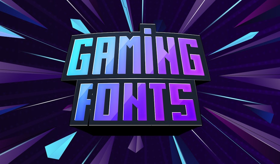
Guide to the best video game fonts
—
The categories of text in video games
—
In order to choose the best gaming font, you not only have to consider genre, tone and audience but the many roles that text plays in video games. Each of these roles may serve wildly different purposes, and the font style must be appropriate for the context. With that said, using a different font for every scenario is not realistic. From a design standpoint, this can lead to visual inconsistency, which breaks immersion (along with any sense of branding).
Usually, the fewer fonts you use the better: at minimum, you want to settle on a headline font, a subtitle font and a readable body copy font. The challenge then becomes choosing the ideal font for the various situations while keeping the number of fonts low and maintaining a general consistency across all the fonts used in the game. All the more reason to plan ahead.
Keep in mind that besides changing the font, you can also use the principles of visual hierarchy—such as applying a different weight, style, size, orientation, position, color and/or background—to create separation and degrees of importance.
Finally, if you haven’t already, make sure you brush up on the different types of fonts.
Without further ado, let’s jump into some of the most common scenarios in which you’ll need to choose a gaming font.
Gaming logos
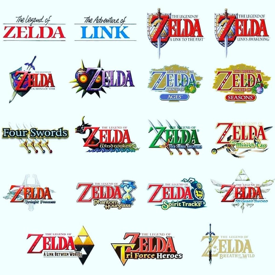
A video game logo serves the purpose of branding, encapsulating the tone and genre of the game. In this way, the lettering style used in the logo often sets the standard for the other typefaces to follow. Although usually a logo typeface should be custom, many brands use an existing font as a basis for their wordmark. When choosing fonts for other categories, consider typefaces that will either harmonize with or contrast the logo font
In the past, video game logos were intensely stylized and memorable for all the wrong reasons (I present to the jury, Exhibit A…). These days, video games (and the gamers themselves) have grown up, and more logos have caught up to modern design standards—going for streamlined, minimalist aesthetics. After all, there’s a lot of impressive art going on in the games themselves, and the logos don’t have to try as hard anymore.
Simplified logos can also easily layer on effects like bevelling or metallic textures, making the logo look like it has come right out from the game’s world.
With all that said, it’s not as though more stylized logos are completely out-of-vogue. The logo for Outer Wilds (2019) not only contains two different font types, but two different design approaches: one word is sleek and futuristic and the other is organic and illustrative.
Regardless, the style just feels right for Outer Wilds. It encapsulates the duality of space travel and planetary exploration (namely the trees of Timber Hearth). Outer Wilds is also a game with plenty of goofy moments, from the unpredictable physics to your taped-together spaceship, and the mismatched logo fits that fun and weird vibe.
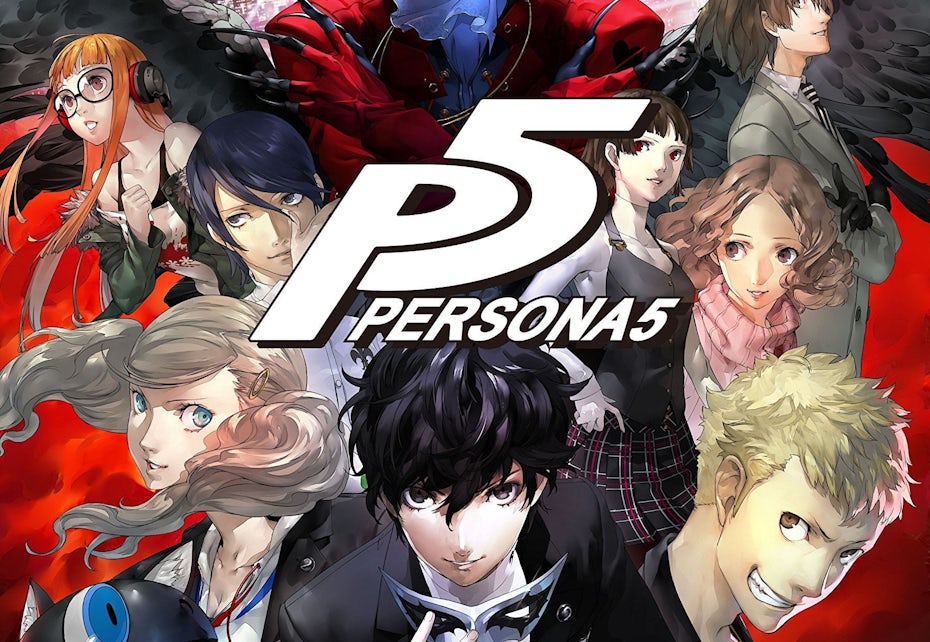

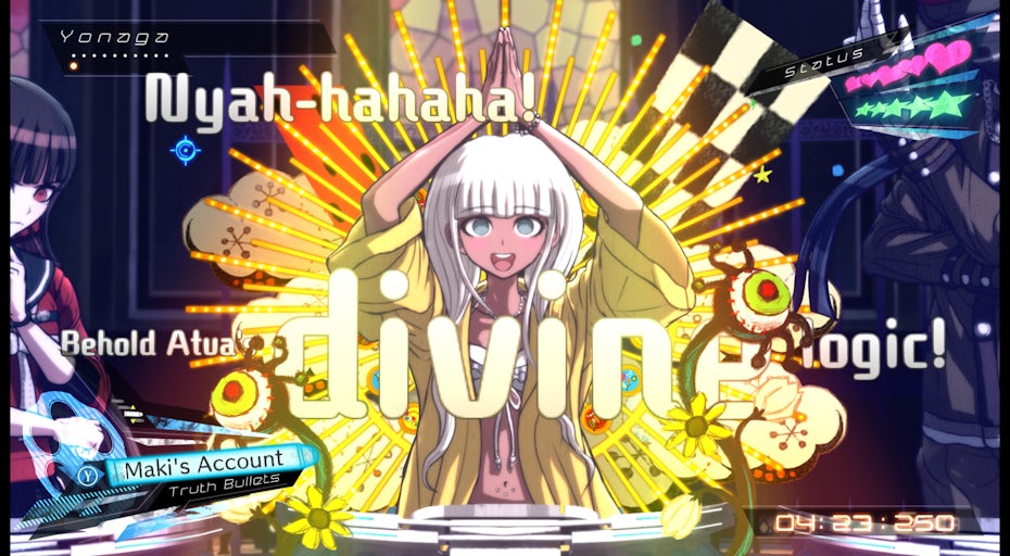
Persona 5 (2016), meanwhile, uses a bold, oblique sans serif for its logo font. The rest of the game’s text wildly contrasts this with zany, ransom note cutouts. Despite these differences, the white color and general thickness of the letters keeps us believing that these typography styles all belong in the same universe.
Title sequences and credits
Although—let’s face it—most players are not diligently reading the credits, the overall purpose of a credit sequence is to convey simple information: who worked on this game and what were their roles. To that end, it is common for credit sequences to emphasize readability (sans serifs are recommended for digital reading). There are also a few different contexts for credit sequences to keep in mind.
Opening credit sequence for Observation, by No Code
The opening title sequence, which is generally much shorter than the end credits, can be an opportunity for much more creativity—as pioneered in film by designers like the legendary Saul Bass. Some games, like Observation (2019), will include an artistic title sequence with theme music, not unlike prestige TV. This allows the font to be animated and more thematically relevant.
In Prey (2017), as the protagonist is taken on a fateful helicopter ride, the opening credits are displayed in-game like massive billboards interspersed along the vista.
Title sequence for Prey, via PoliticalAtheos / Arkane Studios
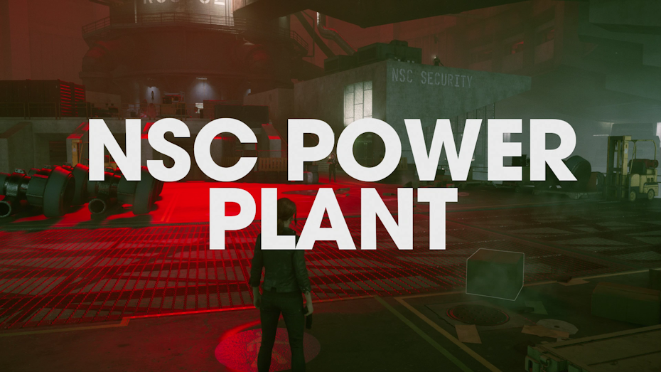
We can include in this category the titles of specific game environments that the player has entered. A particular trend in this arena has been for towering titles that take over the entire screen, as in Control (2019)—where the oppressive size of the text creates a daunting effect.
Alternatively, the Kingdom Hearts series creates a custom logo for each environment. The Dark Souls series, meanwhile, (a great study for repurposing the same font in various contexts) uses their standard serif to display environment names, with an audio cue instead serving up the ominous portent that accompanies entering a new area.
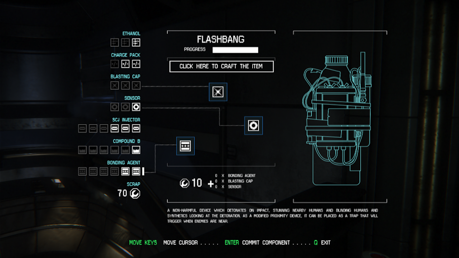
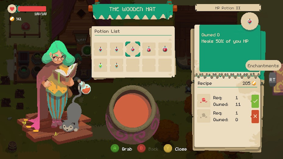
Gaming menus
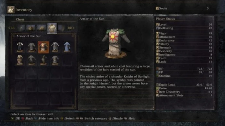
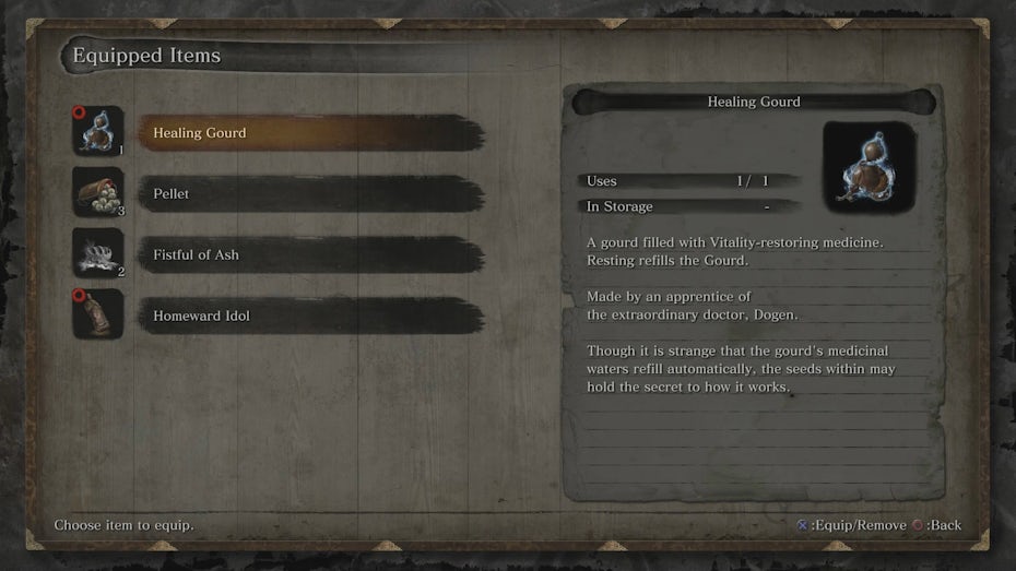
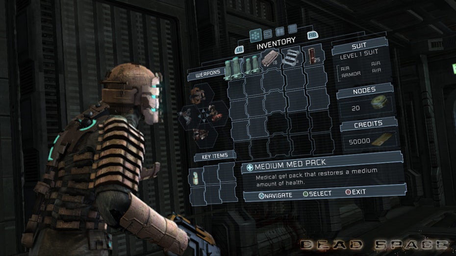
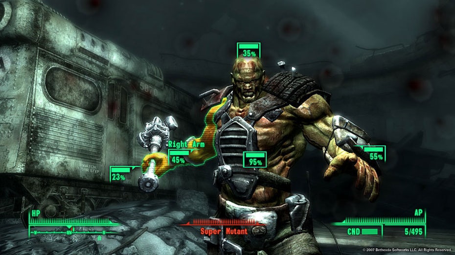
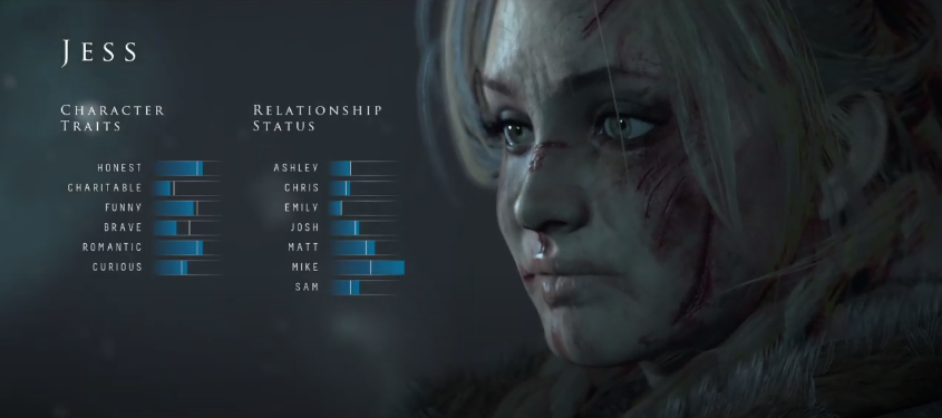
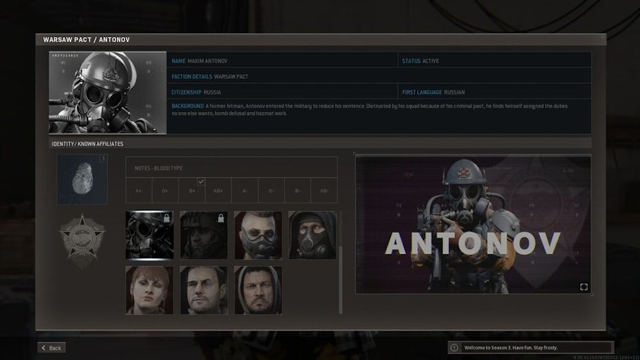
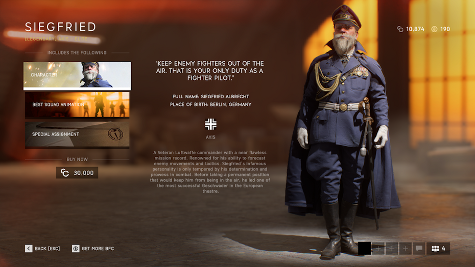
Video game menus exist to give the player vital information about their character’s stats, items, level progression, objectives along with game customization options. This is where visual hierarchy and UX principles really come into play as there is a lot of competing data for the player to digest at once.
Often, headlines and body copy are the main font choices you have to make here. The headline can be more attention-grabbing whereas the body copy usually comes in the form of a paragraph. It is also perfectly fine to use the same font for the headline and body, as studio From Software does in their famous item descriptions, using positioning instead to differentiate between them. Additionally, in Sekiro (2019) they emphasize the headline with a background brush stroke.
There are a few subsets of menu text that we’ll consider part of the same general family: title menu, tutorial, HUD, and results screen. These text scenarios serve the same purpose of delivering contextual information, but there are some subtle differences of purpose to consider as you make your font selections.
- The title screen menu is usually displayed with the logo and must fit directly in that context. The list of menu items is usually sparse (New Game, Load Game, etc), though this also might include a lobby or character select screen in multiplayer games. The purpose of this font here is to get the player excited to play the game, so designers are free to take some artistic license.
- Tutorial text usually interrupts early gameplay with rules or controls, often in some form of pop-up. Tutorial tips are also commonly repeated on loading screens after a player has died. As these are usually obtrusive and sometimes aggravating (though necessary), the font should aspire to be as straightforward and simple as possible.
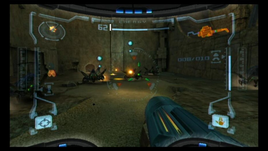
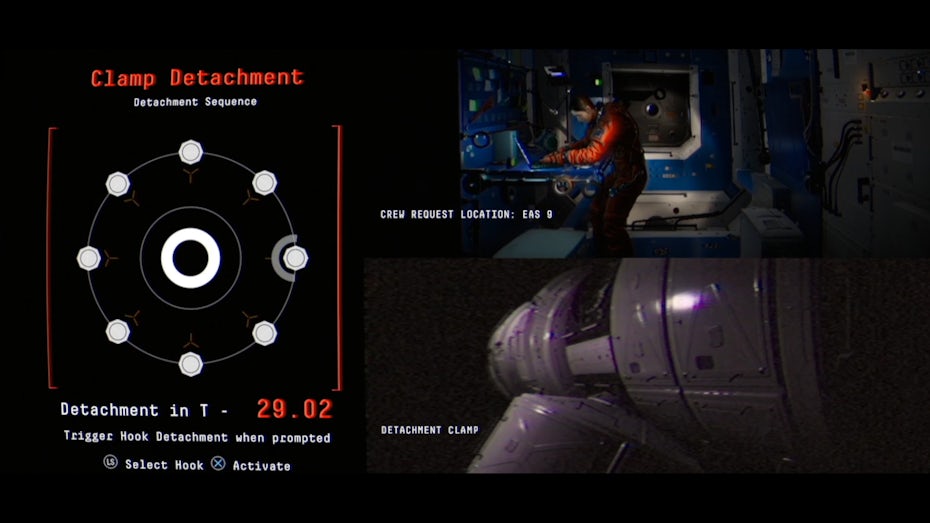
- The HUD (Heads-Up Display) is the moment-to-moment information, such as the health bar and navigational tools, that are overlaid on the screen during gameplay. Fonts used in the HUD are interacting with the entire game world, which means they must be legible in a variety of lighting and color contexts. They also are typically paired with icons (such as waypoint markers and crosshairs), and the font and icon style should look like they belong together. As this has the potential to be the most immersion breaking (so much so that many triple A games reduce the HUD or eliminate it entirely) fonts have to accomplish the task of being useful without being distracting.
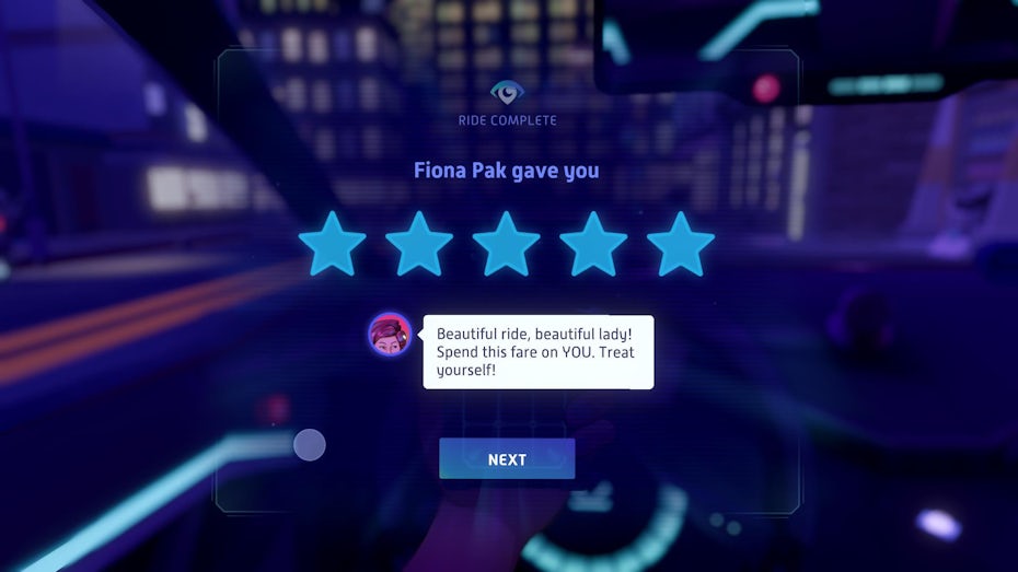
- Results screens show the player information regarding how well they have done after completing a mission, battle or level. The fonts here straddle the line between being informative and celebratory. Generally, you will use the same straightforward body text explaining the actual results with something more decorative headlining the screen.
As a final note, menus can sometimes be tied to the game narrative (or diegetic, which we’ll discuss later), imitating a character’s journal and their specific handwriting. This tends to work for simpler menus, such as Cuphead’s item store, so that you can focus on authenticity without too many informational variables that might confuse the player.
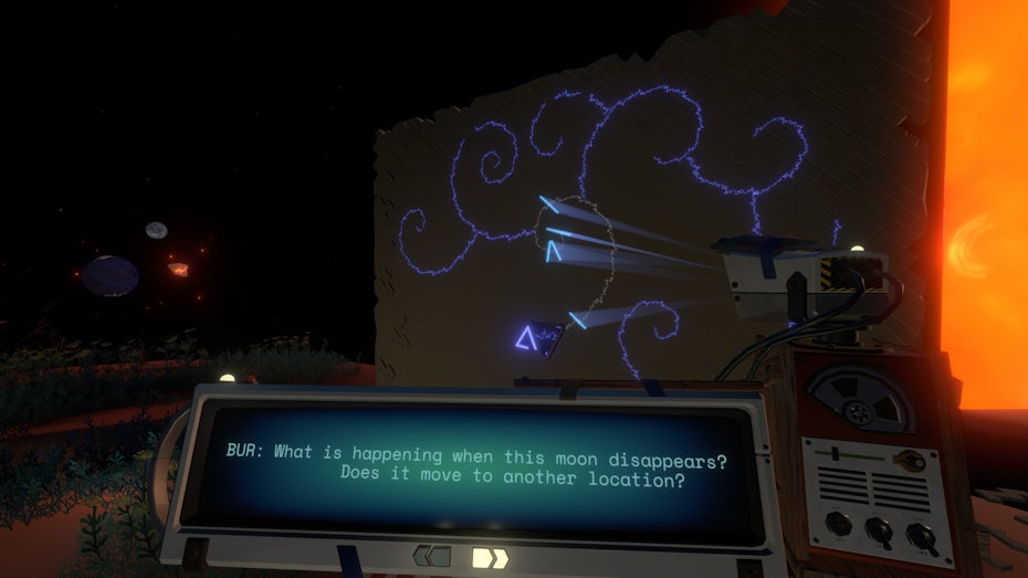
Dialogue and subtitles
Subtitle text used to be a regular feature of video games, as limitations in lip syncing always made understanding a character’s speech harder to follow. Nowadays, as big budget games become more realistic, it is starting to become less relevant.
Some gamers still prefer subtitles, and of course it remains an important accessibility feature. The latter should take priority when choosing a font, despite the temptation to make subtitle text unobtrusive. This means avoiding font styles that are too condensed or thin to be easily read.
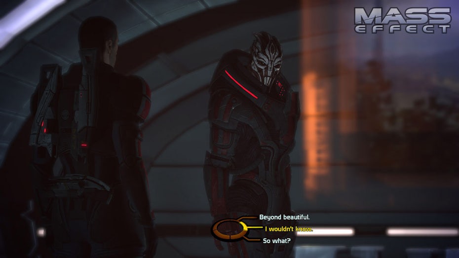
Dialogue boxes (as commonly found in JRPGs and Visual Novels) usually end up on the more decorative side—because why choose a framing box over plain subtitles if you’re not going to do something with it? Generally, the font should match the aesthetic of the text box.

Game over screens
In most video games, death is inevitable. Sometimes, it’s even part of the fun. Although it is the result of a player’s failure and the player is potentially feeling some frustration, a good game over screen can inspire joy instead of tears.
The text for a game over screen thus is an opportunity for a lot of, sometimes wild, creative license. This means that some form of hand lettering is preferable to a uniform font, and it’s one of those rare exceptions that it can be okay to stray away from the rest of the game’s fonts. At the same time, if the game is particularly difficult, the player will want to get back into it as quickly as possible. In this case, a lot of game over fanfare might only add to their frustration, and a simpler approach may be preferable.
Metal Gear Solid game over via Rukki580 / Konami
Diegetic text
Up until now, we’ve been talking exclusively about game text that is directed towards the player, existing outside of the game’s narrative. Depending on how realistic the game is, there are instances where text appears within the game world—such as signs, posters, letters, labels and book covers. This is called diegetic text, which is similar to diegetic sound in film.
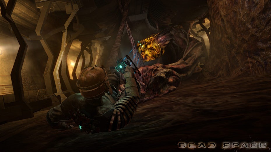
Sometimes, game designers use diegetic text to seamlessly incorporate elements of the HUD into the game world, such as the bullet counter displayed on the back of the gun in Dead Space (2008). All in all, the purpose of diegetic text is to be immersive, and choosing the correct font depends on doing research for the specific context you need the font for.
But a word about any handwriting in video games: whenever possible, it is best to have real people write out the text themselves. Handwriting is supposed to be unpredictable and personal, and fonts are by definition predetermined, even when they are attempting to mimic handwriting. It’s an added touch of authenticity that can go a long way.
Gaming fonts by genre
—
In addition to considering the purpose of the text and the nature of its information, the style of your gaming font is largely dependent on genre. Many standard video game genres (platformer, puzzle game, metroidvania) tend to refer to gameplay mechanics, but for the purposes of this article, we’ll consider genre from an aesthetic standpoint, in terms of setting and mood.
Though genres can be useful when discussing broad categories, they are inherently arbitrary. Your game may contain elements from multiple genres at once, and in that case you should factor in the overall tone for your font decisions.
Action/adventure game fonts
Action/adventure is a murky genre, but it tends to describe picaresque stories of far off places and daring heroics—big budget romps like Tomb Raider and Uncharted being the quintessential examples. Otherwise, fonts in this genre tend to go for a rugged, square look and weathering effects such as chipped or missing edges are common.
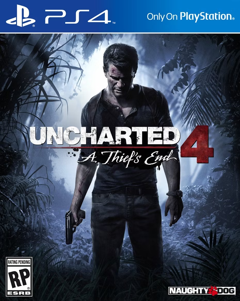
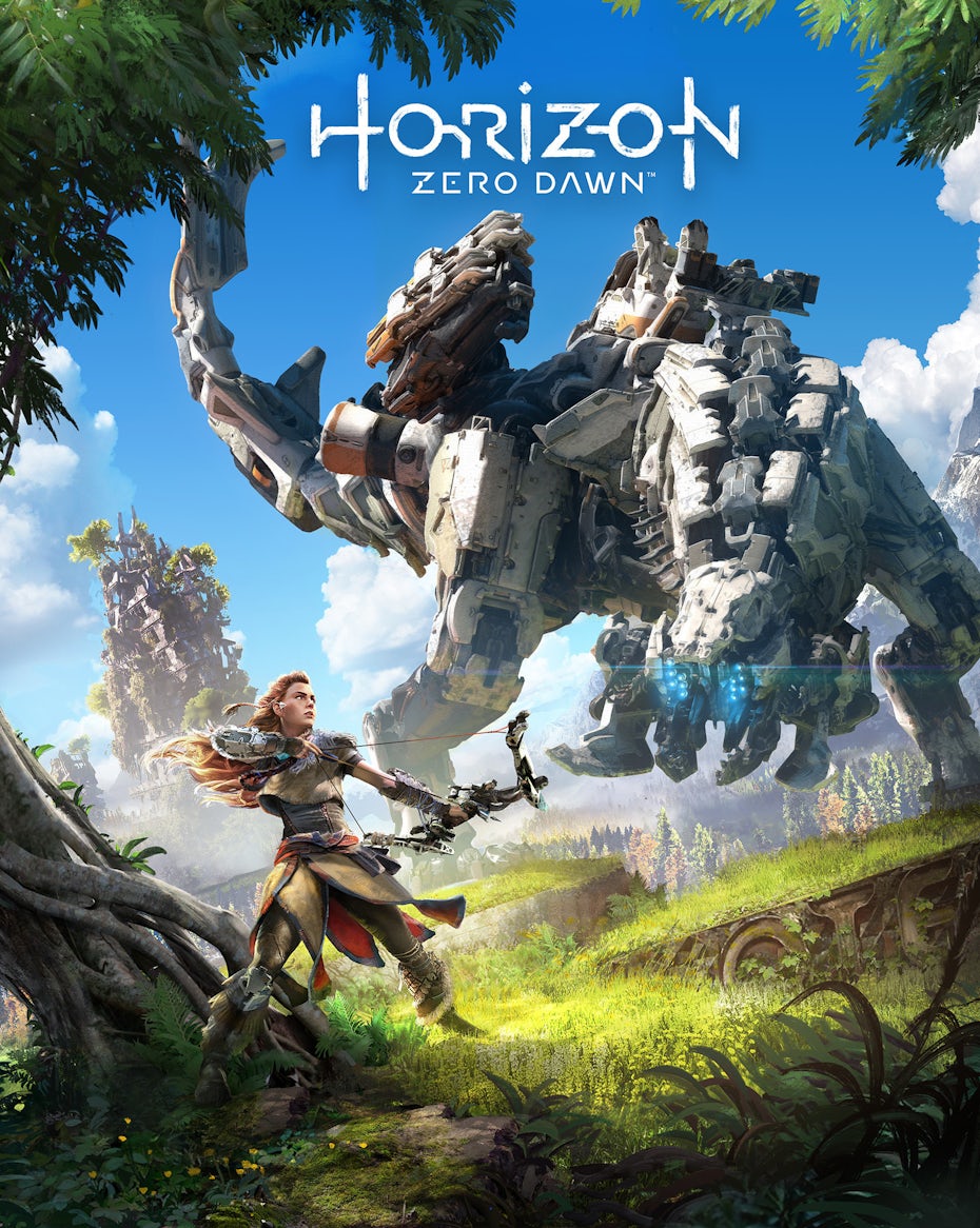

The purpose of these blocky sans serifs is to communicate strength and resilience: their rectilinear shapes are reminiscent of stones and bricks. These games also—let’s be honest—tend to feature fairly safe storylines in which the adventuring heroes survive a multitude of over-the-top action sequences, and the fonts likewise appear built to survive.
Examples of action/adventure gaming fonts
- Helvetica Now
- Uni Sans
- Futura
- Glober
- Modesto
- Aileron
- Bowlby One SC
- Bambusa Pro
Fantasy game fonts
Fantasy games are similar enough to action/adventure games, but they involve magic, quests and are often set in the ancient past. This makes classic, thin serifs an excellent choice to give a storybook or ancient scroll appearance. Alternatively, designers can use sans serifs with pre-digital typographical elements, such as the journal font in God of War (2017) that includes the classical lowercase “a” and “g” variants.
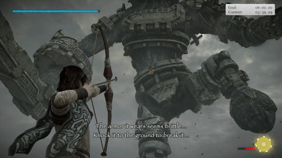
While it can be tempting to fully mimic ancient handwriting, be wary of gimmicky, try-hard, widely disliked typefaces like the Papyrus font used in (the otherwise phenomenal) Shadow of the Colossus (2005).
Examples of fantasy gaming fonts
- Luminari
- Giveny
- Bogart
- Cambria
- Neue Swift
- Warton
Sci-fi game fonts
Being set in the near or distant future, sci-fi games are all about taking what we already have and pushing it to extremes.
These days, minimalist, geometric sans serifs are standard for digital screens. Sci-fi games often take these fonts and exaggerate their hard angles or flattens their curves, illuminating them with the occasional neon glow. This has the effect of making the fonts feel almost entirely computer generated, which is how we often imagine everything to be in the future, for better or worse.
Examples of sci-fi gaming fonts
- Odibee Sans
- ITC Bauhaus
- Univers
- OCR-A
- Building
- Geomancy
- Devant Pro
- Aileron
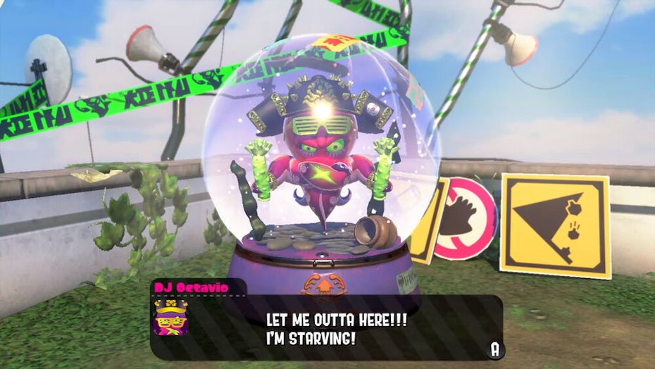
Horror game fonts
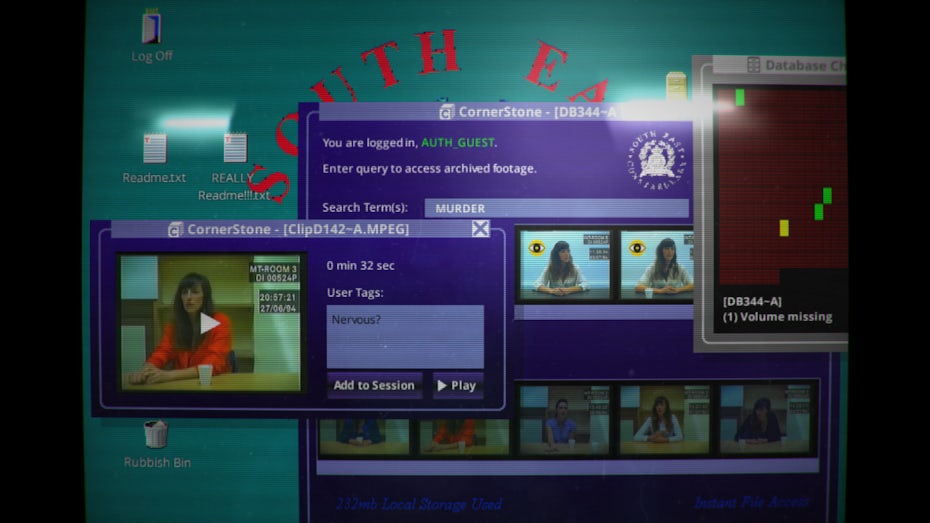
The horror genre has a few diverse takes on font choice. Classic horror games like Resident Evil (1995) and Silent Hill (1998) are rooted in puzzle mechanics and text adventures, and they dole out limited information to the player about items in the environment using detailed images and sparse text.
Both also appeal to the idea of ancient evil (old mansions, an abandoned town), and they use formal, gothic serif fonts that evoke decayed grandeur. Many modern horror games, like Until Dawn (2015), use a similar font style in homage. Detention (2017) chooses a typewriter font for its ghost story, thematically conjuring the spirits of fonts gone by.
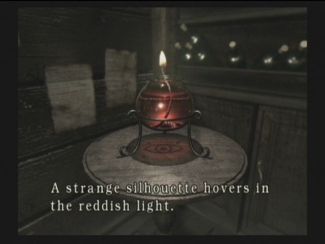
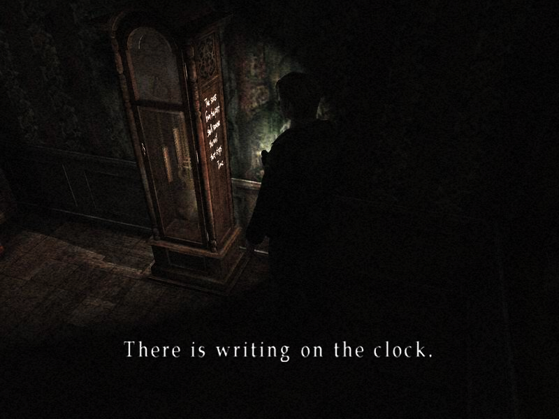
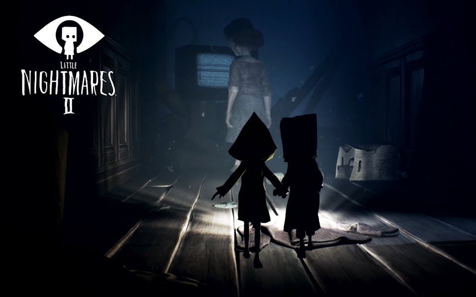
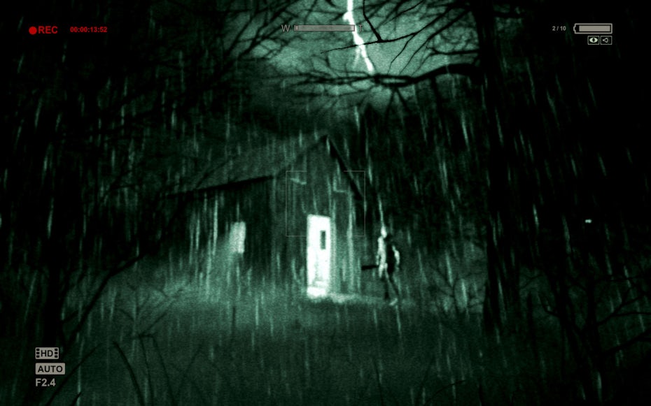
Horror games also tend to prioritize immersion. This often leads to fonts that are diegetic, as in the VHS camcorder typefaces in Outlast (2013), or fonts that feel like they could have come from the game world, as in the thin, childish handwriting in Little Nightmares (2016).
Examples of horror gaming fonts
- Bodoni
- Didot
- Garamond
- Baskerville
- Exo
- Museo Sans
- Docu
- Gafata STD
Military game fonts
In real life, stencil fonts are commonly associated with the military. Though this has now become a cliche, the reasoning behind the style is simple: stencils are no-nonsense and easily stamped on. In the heat of battle, militaries are typically looking for practicality over artistic flair in their text, and designers can consider this in their font choice: going for something straightforward.
Military games also share many qualities with the sci-fi genre in their UI. They are looking to show off gadgets and make them feel futuristic and cool. This is why a game like Battlefield V (2018) uses sleek and modern fonts in its HUD despite taking place during WWII.
Examples of military game fonts
- Frutiger
- Courier
- Dejavu Sans
- Proxima Nova
- Grafton
- TT Norms Pro
- Rufina Stencil
Kids/educational game fonts
The attention span of children is notoriously short, even—believe it or not—when they are playing video games. As such, kids’ games are often none too shy about being attention seeking, with everything from bright colors to exaggerated characters. In the realm of fonts, kids’ games typically go for decorative, cartoony styles such as Mario’s famous cut-out font.
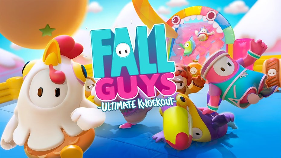
Not only are the letterforms designed to be goofy in and of themselves, they are often randomly tilted or placed along different baselines, giving each letter a fun and bouncy look. Even if a game is not geared exclusively for kids, it can still take advantage of the fonts that go along with a cute, bubbly aesthetic, as in the bounce castle inspired font in Fall Guys (2020).
While educational games don’t have to be directed at young children, most are. Their goal is typically to make learning fun, and they tend to balance the cartooniness of kids’ games with the seriousness of a classroom.

Examples of kids gaming fonts
- Wonder Night
- Canilari
- Krona One
- FF Din
- Hypologic
- Restora
- Moniqa Typeface
Retro game fonts
When it comes to video games, nostalgia is a powerful thing. For this reason, many games (especially in the indie sphere) use aesthetic styles that appeal to the player’s longing for the past. It’s why pixel art (and pixel fonts) remains popular to this day despite the superior graphical power of modern gaming machines.
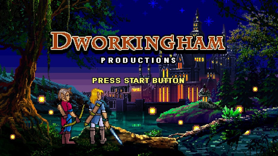
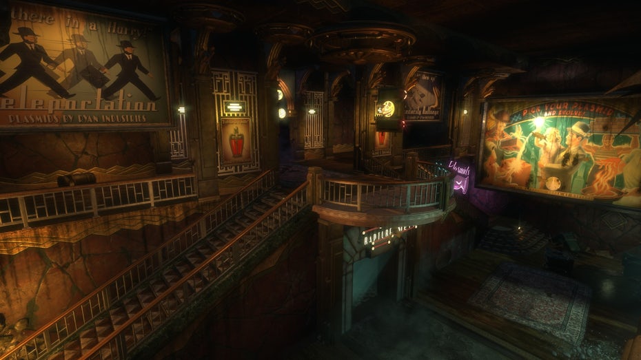
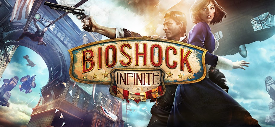
Retro gaming fonts often fit a diegetic purpose, mimicking the time period you wish to immerse the player in. Bioshock (2007) is, among other things, a veritable showcase of diegetic assets, from posters to music to signage. Art Deco and various forms of 30s era fonts abound.
Her Story (2015), meanwhile, takes place on a 90s computer interface and the font choice suits this purpose. No Code Studio’s creative director John McKellan uses a tone of old school computer typeface styles both for nostalgic and diegetic purposes.
Examples of retro gaming fonts
- Chicago
- VCR OSD Mono
- Italico
- FF Blur
- Metropolis Typeface
- Hazel Deco
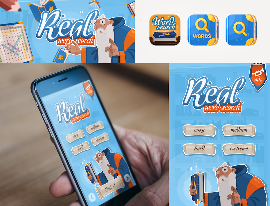
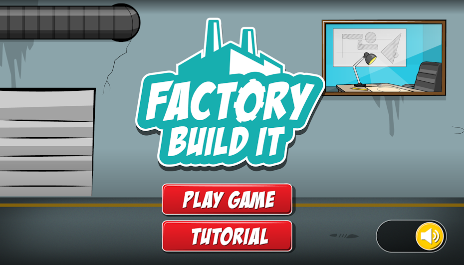
Mobile game fonts
Being readily accessible, mobile games are typically aimed towards casual users—those riding the subway or waiting in line at the DMV. So while the font style often depends on some of the other genres we’ve discussed (mobile after all is more of a platform than a mood), there are some generalities to keep in mind.

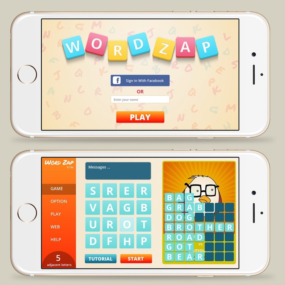
Mobile devices tend to prioritize icons over words, which means any fonts used should take their cue from the icon style (and visa versa). With that said, chunkier fonts tend to be popular since bigger, simpler text makes for easier reading on smaller screen sizes. Mobile games also seek to deliver quick wins, which means congratulatory screens or pop-ups are more common, leading to decorative font styles that will be read as fun and exciting.

Examples of mobile gaming fonts
- FF Avance
- Ostrich Sans
- Alfa Slab
- Reglo
- Skye
- Mattone
Get a flawless victory with the right gaming font
—
When there is so much else to worry about in making a video game functional—let alone profitable—it’s easy to think of font choice as an afterthought. But fonts are tools for expression, and they are just as powerful as any Gravity Gun or Buster Sword. They can also fail powerfully if you are not careful.
While this guide can give you a place to start, be sure to consider font choice and its effect on your player from the very beginning of the project. And always make sure you’re working with a UI designer who knows their fonts.
Want the perfect font for your game design?
Our talented designers can make it happen.
The post Fonts for games: how to win over players with top typography appeared first on 99designs.